CSS blend modes are a new feature that let us blend an element’s background layer with another layer. They’re commonly used for blending a background image with a background color.
In this post, we’ll take a look at a simple blend mode mixin I recently created and used on several Sass projects.
Using blend modes
When we use the background-blend-mode property on an element, it mixes the background image and color together based on the blend mode we set.
The simple version of the mixin accepts three arguments: the image path, background color, and blend mode:
@mixin blendy($img, $color, $blend) {
  background-image: url('img/#{$img}');
  background-color: $color;
  background-blend-mode: $blend;
}
Now we can include the blendy mixin in any rule that needs a background blend, like this:
.blend {
  @include blendy("mountains.jpg", firebrick, multiply);
  width: 200px;
  height: 200px;
  border-radius: 50%;
  background-size: cover;
}
What about gradients?
What’s great about blend modes is that they also allow blending between images and gradients. This can create some interesting blending effects.
First, we’ll declare a variable for our blend mode gradient:
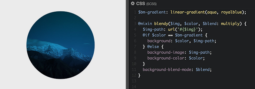
// Blend mode gradient
$bm-gradient: linear-gradient(aqua, royalblue);
Next, we’ll need to adjust the code in our mixin to accommodate gradients. Since gradients are actually background images — not colors, let’s add an @if/@else condition that displays multiple background layers if we pass $bm-gradient as the $color argument:
@mixin blendy($img, $color, $blend) {
  $img-path: url('#{$img}');
  @if $color == $bm-gradient {
    background: $color, $img-path;
  } @else {
    background-image: $img-path;
    background-color: $color;
  }
  background-blend-mode: $blend;
}
This time, instead of a color value, let’s pass the gradient variable:
.blend {
  @include blendy("mountains.jpg", $bm-gradient, multiply);
  ...
}
Finishing touches
Currently, we’re limited to one blend mode gradient and we want the mixin to accept values from a variety of variables. For example, any of these:
// Blend mode gradients
$fancy-grad  : linear-gradient(aqua, royalblue);
$transp-grad : linear-gradient(black, transparent);
$snarky-grad : linear-gradient(firebrick 40%, blue);
To do that, we’ll pass both $color and a new argument,$grad, as optional arguments set to null by default. And, since multiply is the most widely used blend mode (at least for me), let’s set the default blend mode value to multiply.
@mixin blendy($img, $color: null, $grad: null, $blend: multiply) {
  $img-path: url('img/#{$img}');
  @if $grad {
    background: $grad, $img-path;
  } @else {
    background-image: $img-path;
    background-color: $color;
  }
  background-blend-mode: $blend;
}
Now we can simply specify the image and the blend color or gradient we want to display:
.blend {
  @include blendy("mountains.jpg", #00bfff);
}
.feat {
  @include blendy("featured.jpg", $grad: $fancy-grad);
}
Check out the final result on CodePen:
See the Pen LEQWev by Guil H (@Guilh) on CodePen.
Tweet this article