Viewport-relative units (vw, vh, vmin, vmax) are a new set of dynamic CSS units for sizing elements. They’re called “viewport-relative” because they eliminate dependency on parent elements and allow sizing based on the viewport size. This makes them a handy unit for defining font sizes and building fluid layouts.
I like to use the vw (viewport width) unit on large headlines—I’ll usually fiddle with the font-size value until it looks right. But what if we could define a pixel-based value, then have Sass convert it to a flexible vw value? In this article, we’ll see how we can create viewport-relative headlines out of pixel units.
vw function
When we use the vw unit, 1vw is equal to 1% of the viewport width. So if an element’s font-size value is set to 1w, it means that if the browser is 1000px wide, the element’s computed font-size value is 10px.
To convert a px value to vw, we’ll need a pixel-based context equal to 1% of some value—let’s use 1% of 1000 (1000 * .01). Next, we’ll create a Sass function that gets the context value in pixels:
@function get-vw($target) {
  $vw-context: (1000*.01) * 1px;
  @return ($target/$vw-context) * 1vw;
}
The function also divides the pixel value we pass via $target by the 1% context, then converts it to vw. Now we can use the get-vw function in a font-size value.
.headline {
  font-size: get-vw(72px);
}
The final output is:
.headline {
  font-size: 7.2vw;
}
If the viewport is 1000px wide, the font size for .headline will be exactly 72px. When the browser width changes, its computed value will also change and resize relative to the viewport.
Creating a mixin
When using fluid units like vw, it’s good to set a max font-size so that our text doesn’t get too big on wider screens. We can do this a number of ways, but let’s say we’ve already defined media query breakpoint variables in our project—something like this:
// Media query variables
...
$wide-screen: "(min-width: 1025px)";
We can create a mixin that uses get-vw and outputs a media query to set the font size back to pixels once the viewport reaches the widest breakpoint:
@mixin vw($size) {
  font-size: get-vw($size);
  @media #{$wide-screen} {
    font-size: $size;
  }
}
Then, include the mixin in place of the font-size declaration:
.headline {
  @include vw(72px);
}
Changing the context
If we want a vw font-size value that’s relative to the widest breakpoint (1% of, say, $max-breakpoint), we can adjust our SCSS to output those values:
// Breakpoint variables
$max-breakpoint: 1025;

// Media query variables
$wide-screen : "(min-width: #{$max-breakpoint}px)";
Then, pass the $max-breakpoint variable in the function:
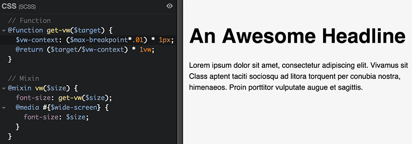
// Function
@function get-vw($target) {
  $vw-context: ($max-breakpoint*.01) * 1px;
  @return ($target/$vw-context) * 1vw;
}
Closing
This may seem like extra work up front, but the end result gives us a viable solution for displaying fluid headlines.
The vw unit has strong support in the latest browsers. As a fallback, simply include a regular font-size value first. Browsers that do not support vw will display the em or px value instead:
.headline {
  font-size: 4.5em;
  font-size: vw(72px);
}
Check out one of the examples on CodePen:
See the Pen px to vw by Guil H (@Guilh) on CodePen.
Tweet this article